If you own a FedEx Ground CSA, the Picture Proof of Delivery (PPOD) report is one of the two SPOTlight scorecards FedEx grades your contract performance on. The other is RYDE. Together they're how FedEx measures the customer experience your CSA delivers — and quietly, how they decide which contractors get expansion conversations and which get harder ones.
Most owners look at the PPOD report once a month, see a percentage, and move on. That's not enough. The dashboard has three pages, four image classifications, and a set of filters that, once you know how to use them, turn the PPOD report from a number you check into a coaching tool you run your CSA from.
This guide walks through every page of the PPOD dashboard, what each metric actually means, and how to build a weekly review habit that protects your contract.
What PPOD actually measures
PPOD is not one number. It's two parallel measurements:
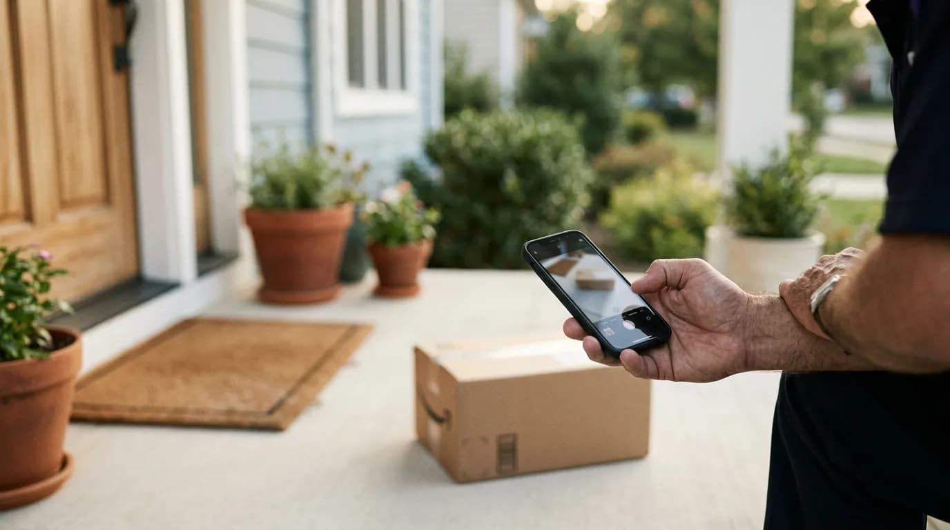
- Photo capture — did the driver actually take a photo at a residential stop where one was required?
- Photo quality — when a photo was taken, did it actually show the package in a way that satisfies the customer and FedEx's ML/AI image classifier?
A driver can have a high capture rate and poor quality. They can also have great quality on every photo they take, but skip half the stops where a photo was required. The dashboard separates these two failure modes for a reason: they require different coaching.
The four image classifications
Every PPOD photo gets classified by FedEx's ML+AI image quality model into one of four buckets:
- Good Quality — the image clearly contains the package, with a non-sensitive background.
- Poor Quality — No Package Visible — the package isn't visible in the photo.
- Poor Quality — Contains Sensitive Info — the image contains personally identifying information: a face, an address label close-up, a visible house number with the package, etc.
- Poor Quality — Other — generic bad image: blurry, not enough surroundings, taken from inside the truck, blank.
Memorize these. The "Other" bucket is the one most drivers can fix immediately with training. "Sensitive Info" is the bucket most owners don't even know exists — and it's the one that creates real contract risk.
Page 1: PPOD Overview
This is the page most owners stop at. It's a top-line summary of capture and quality across your entire CSA for the selected time period.
What to look at, in order:
PPOD Eligible Stops. This is the denominator. Every metric percentage is computed against this number. If your eligible-stops count drops sharply week-over-week, something operational changed — a route shifted, a CSA boundary moved, peak season ended.
Stops with Photos %. This is your capture rate. A healthy CSA runs 95%+. Anything below 92% means drivers are skipping photos at stops where one is required — usually because they're behind schedule or assuming the customer was home.
Met Customer %. The percentage of residential stops where the driver handed the package directly to a customer (no photo required). High Met Customer % is generally good — it correlates with positive RYDE scores — but if it's wildly higher than your peer CSAs, FedEx may scrutinize whether photos are being skipped under the guise of "met customer."
No Photo Other Reason %. This is the "I didn't take a photo and I also didn't meet the customer" bucket. Anything above 3-4% is worth investigating.
Image Quality breakdown. Across the photos that were taken, what percent fell into each of the four classifications? The Good Quality % is your headline metric. The other three are your coaching topics.
Page 2: Resource Detail (per-driver view)
This is where coaching actually happens.
The Resource Detail page lists every driver in your CSA with their individual PPOD metrics: Residential Stops, Eligible Residential Stops, PPOD Stops with Photo %, Met Customer %, No Photo Other Reason %, Good Image %, No Pkg Visible %, Sensitive Info %, and Other %.
A few tactics for using this page well:
- Sort by Good Image %. Your bottom 3 drivers each week are your coaching list. The top 3 are your example.
- Filter to a single driver to see daily and weekly trends. Use the date selectors to compare a driver's last week vs four weeks ago. A driver whose Good Quality % has been steadily dropping for a month is not a bad driver — they're a driver something changed for.
- Compare a single resource's averages against the CSA average. The "Selection Average vs CSA Average" panel on the right exists for this. A driver who is 10 points below the CSA average on No Pkg Visible % is your weekly 1:1 conversation.
This page is also where you spot data anomalies. If a driver shows 100%+ on PPOD Stops with Photo — yes, this happens occasionally — it's usually because the eligible-stops count was understated for that day. Investigate before drawing conclusions.
Page 3: Poor Quality PPOD Package Detail
This is the detective page. Every individual poor-quality image is listed here with the Track ID, Resource (driver), Work Area, Classification, the AI's validation description, and the delivery address.
A few things this page is unmatched for:
- Coaching with specific examples. "On April 29 at 140 Intracoastal Dr, you delivered to a mobile home with a porch and the image was classified as No Package Visible. Here's the image, here's what we want next time." Clicking the Track ID link takes you to the actual PPOD on fedex.com, image included.
- Spotting "Sensitive Info" patterns. If one driver is generating the bulk of your Sensitive Info flags, they probably have a habit — close-up label shots, photos that include the customer, etc. Coach them once and the metric usually corrects within a week.
- Catching environmental issues. If the same address shows up in your poor-quality list every week ("the image is extremely blurry — locker system display"), the issue is the location, not the driver. Time to talk to FedEx Ground station management about an exception.
Time periods, filters, and the data-refresh window
Three pieces of mechanical knowledge that owners get wrong:
- The time period selector (Date / Day / Week / Month) at the top of every page changes what the trend chart shows. Use Day for tactical reviews, Week for coaching reviews, Month for contract-prep conversations.
- Filters carry across pages. If you filter to Work Area 0141 on the Overview page, you're still filtered to 0141 when you go to Resource Detail. Clear filters before sharing a screenshot with someone else.
- Prior-day PPODs are available by 6:30 AM EST. That means your morning coffee review is on yesterday's data. Don't expect today's stops to show up until tomorrow morning.
A weekly PPOD review cadence that actually works
Most owners either review PPOD daily and burn out, or review monthly and miss everything. A middle path:
Daily (5 minutes):
- Check Overview page for the previous day. Note any number that's more than 2 percentage points off your normal range.
- Skim Poor Quality Package Detail for anything obviously wrong (5+ entries from the same driver, repeated "Sensitive Info" flags).
Weekly (20 minutes, same day every week):
- Open Resource Detail page filtered to the last 7 days.
- Identify your bottom 3 drivers on Good Quality %.
- For each, pull 2-3 specific examples from Poor Quality Package Detail.
- Schedule a 10-minute coaching conversation with each before the week ends.
Monthly (45 minutes):
- Compare this month's CSA-level Good Quality % to the previous 3 months.
- Look at trend, not absolute value. A 0.5% improvement on a 91% baseline is real. A 0.5% decline from 95% is a signal.
Three interpretation mistakes to avoid
- Treating Met Customer % as automatically good. It is good when it's earned. It's a red flag when it's inflated to hide skipped photos.
- Ignoring Sensitive Info as a category. It seems like the small bucket on the chart. It's also the one with the most regulatory and contractual risk attached.
- Reviewing the dashboard once a month and trying to remember what changed. PPOD is a daily-refresh dashboard. Treat it like one. The owners with the best contract standing aren't smarter — they look at the numbers more often, more quickly.
Connecting PPOD to driver pay
Once you know which drivers are running 95%+ Good Quality and which are running 85%, the next question is whether your payroll reflects the difference. If your per-stop pay is identical for both, you're communicating that the metric doesn't matter.
A modest PPOD quality multiplier on per-stop pay — even just +/- 2% — is enough to shift driver behavior within a pay period. We've covered the mechanics of this in How to Tie RYDE & PPOD Scores Into Driver Bonus Pay, and FleetWage can encode the rule directly so it lands on the pay stub without any spreadsheet work.
The PPOD report is the data. Your payroll is the lever. Use both.
See FleetWage in Action
Tell us where to reach you and we'll set up a 20-minute live demo tailored to your CSA count — no slide decks, just the product.
No spam. We'll only use this to schedule your demo.